Headings levels are defined by HTML and define the content structure of a document, the document outline. Most people do not care if a heading is level 1 or 5 or whatever. As long as the importance of a given heading is reflected in the styling they will not notice any disorder. But mismatching heading levels can be fatal for some users.
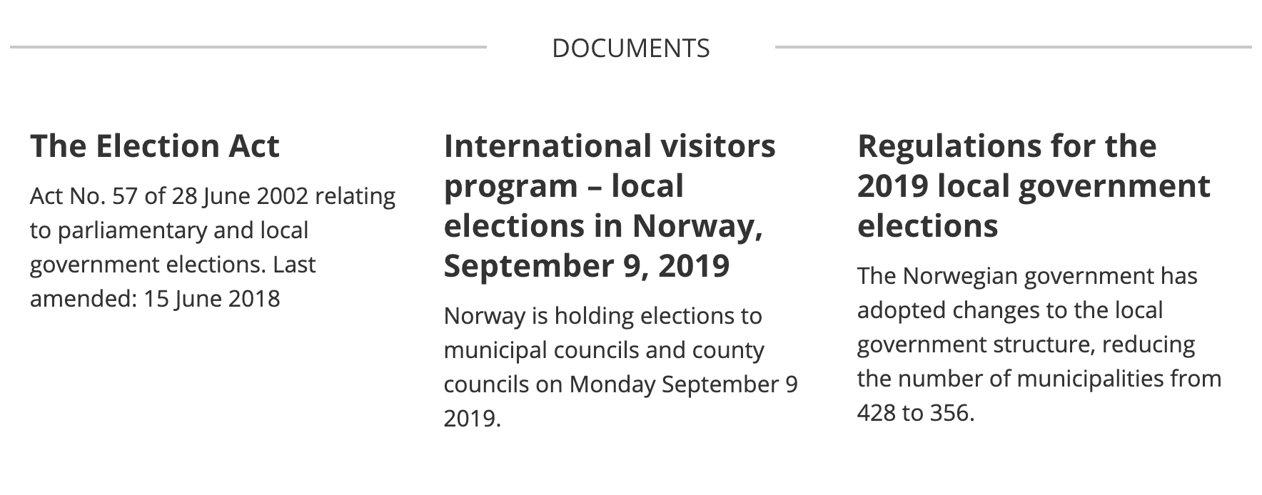
The following example is taken from the website of the Norwegian government. You see a section consisting of a section heading and three blocks each consisting of a heading and some text;

Given the page has a major heading level 1 (H1) at top of the page and a "Topics" section above the "Documents" section the document structure would be like this:
H1 Page title
  H2 Topics
    H3 Topic one
    H3 Topic two
  H2 Documents
    H3 The Election Act
    H3 International visitors program ...
    H3 Regulations for the 2019 local government elections
This would provide a useful content structure, keeping the H3 headings visually bigger than the sectioning H2 heading.
Now, some would argue that "Documents" should not be a title because the information is not that important. In that case, you would have to change heading levels:
H1 Page title
  H2 Topics
    H3 Topic one
    H3 Topic two
  H2 The Election Act
  H2 International visitors program ...
  H2 Regulations for the 2019 local government elections
But changing the H3 level headings to H2 would not happen automatically in most systems and an editor would certainly never think about it. This leaves us with the following structure:
H1 Page title
  H2 Topics
    H3 Topic one
    H3 Topic two
    H3 The Election Act
    H3 International visitors program ...
    H3 Regulations for the 2019 local government elections
See where this is going? The headlines that used to belong to the "Documents" section are now added to "Topics" which is totally misleading. This is what happens to the document outline removing the H2 title at the "Documents" section.
Why are heading levels and the document outline important?
People using assistive technology (AT) are depending on a well-structured set of heading levels. With a screen reader, you can navigate in different ways. One way is navigating by headings. If you jump one or more heading levels screen reader users will lose orientation navigating by the headlines from the document outline.
In this example a solution could be keeping the H2 heading visually hidden by CSS so that the "Documents" heading wouldn't be available to sighted users, but still would be read to a screen reader user:
H1 Page title
  H2 Topics
    H3 Topic one
    H3 Topic two
  H2 Documents (visually hidden heading)
    H3 The Election Act
    H3 International visitors program ...
    H3 Regulations for the 2019 local government elections
Luckily most websites are (sort of) built with this in mind, but most websites end up having issues skipping heading levels, could be because of changes like in this example. If changes are not carefully planned for, a document will end up with a useless document outline making it inaccessible.