With responsive websites, the same image can be displayed on screens ranging from several thousand pixels wide down to a few hundred.
It is a lot of wasted bandwidth if the user on a tiny mobile screen has to download an image 2000 pixels wide, only to display it as 320 pixels.
There are a couple of ways to get around this problem, but in this article I will focus on the one I find easiest to implement, which is to add a srcset attribute to the img tag: <img src="x" srcset="y" />
Upload one image for each screen size
The basic idea is to upload several versions of an image in different sizes, then link to these images in the srcset attribute. The browser will calculate which of the images will (hopefully) look best for the user's screen size and only download that one image.
A simple example:
<img
    alt="Alt text"
    width="1200"
    height="600"
    src="large.jpg"
    srcset="small.jpg 400w, medium.jpg 800w, extra-large.jpg 2400w"
/>
On a 320 pixel device, the browser will only download "small.jpg", ignoring the larger images. On a device with a large retina display "extra-large.jpg" will be used instead.
This is easy enough to set up for a single image, but it amounts to a lot of work if we are going to upload four different sized images every time we need to add an image to a website.
Contentful's built-in image scaling
If we use Contentful to handle the images, we can take a shortcut by letting it scale the images for us automatically.
Contentful's Images API can do more than just scaling. It can convert the image to another format, change the quality or crop the image. Read more in their documentation:
https://www.contentful.com/developers/docs/references/images-api/
For this example I will use two functions: I am going to scale the original image down to a certain width (keeping the original height/width ratio) and convert the images to the WEBP format. WEBP images are slightly smaller in size than PNG and JPEG.
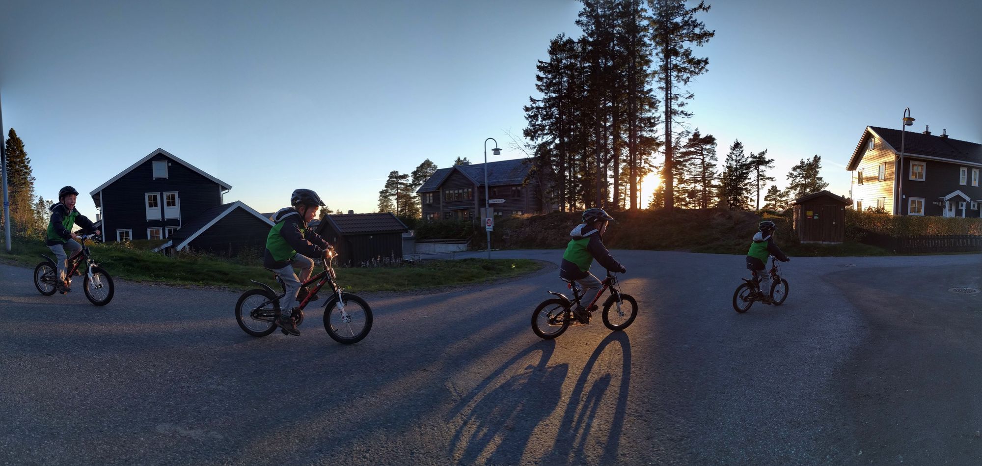
The original photo I have uploaded is larger than the biggest format in the srcset attribute, because I only want to scale down, not up. Scaling up leads to a blurry, pixelated image.
The address to the original photo uploaded to Contentful is this:
//images.ctfassets.net/99usj1e85sjt/38qjhe7gtrRFO0XkojWzdj/46366d72ed942e1ddcd46ee653a9fc71/IMG_00000_BURST20161003180343-PANO.jpg

For each image size, I am adding these query parameters to the end of the original URL:
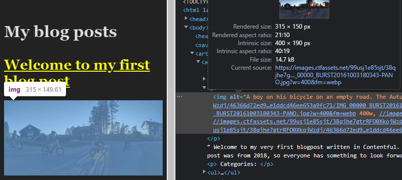
w=400to define the width to scale down to. If I don't define anh=(height) parameter, the height to width ratio is the same as the original.fm=webpto tell Contentful to convert the image to WEBP.
Complete html:
<img
  alt="A boy on his bicycle."
  width="1200"
  height="569"
  src="//images.ctfassets.net/99usj1e85sjt/38qjhe7gtrRFO0XkojWzdj/46366d72ed942e1ddcd46ee653a9fc71/IMG_00000_BURST20161003180343-PANO.jpg?w=1200&fm=webp"
  srcset="//images.ctfassets.net/99usj1e85sjt/38qjhe7gtrRFO0XkojWzdj/46366d72ed942e1ddcd46ee653a9fc71/IMG_00000_BURST20161003180343-PANO.jpg?w=400&fm=webp 400w, //images.ctfassets.net/99usj1e85sjt/38qjhe7gtrRFO0XkojWzdj/46366d72ed942e1ddcd46ee653a9fc71/IMG_00000_BURST20161003180343-PANO.jpg?w=800&fm=webp 800w, //images.ctfassets.net/99usj1e85sjt/38qjhe7gtrRFO0XkojWzdj/46366d72ed942e1ddcd46ee653a9fc71/IMG_00000_BURST20161003180343-PANO.jpg?w=1200&fm=webp 1200w, //images.ctfassets.net/99usj1e85sjt/38qjhe7gtrRFO0XkojWzdj/46366d72ed942e1ddcd46ee653a9fc71/IMG_00000_BURST20161003180343-PANO.jpg?w=2400&fm=webp 2400w"
/>
Complete html with shortened URLs for readability:
<img
  alt="A boy on his bicycle."
  width="1200"
  height="569"
  src="….jpg?w=1200&fm=webp"
  srcset="….jpg?w=400&fm=webp 400w, ….jpg?w=800&fm=webp 800w, ….jpg?w=1200&fm=webp 1200w, ….jpg?w=2400&fm=webp 2400w"
/>
The srcset attribute is not particularly easy to read, especially with long URLs, so make sure you add the necessary 400w width setting after each image address, and don't forget the commas.
