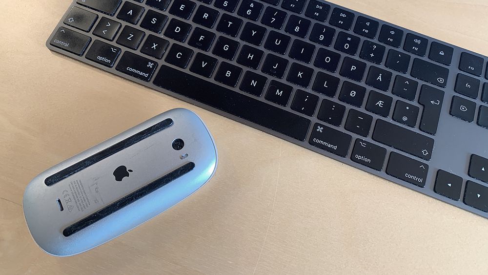
I read the following sentence some time ago and it made me think of how important this issue is. I was investigating the importance of national accessibility requirements in Norway and EU and focusing on people who, for some reason, don't use a mouse when navigating:
Accessibility is more than accommodating people that can't use a mouse. It's also about people that prefer not to use a mouse.
A keyboard-only user could be:
- Anyone with fine motor control restrictions (parkinson's, severe arthritis, etc.)
- Those with disabled hands/arms (accidents, congenital disability, etc.)
- Anyone with large motor control issues (MS, etc.)
- Those who prefer to use a keyboard for most navigation (software developers, typists, etc.)
- Those that don't have a mouse (tablets, cellphones)
Testing is easy!
It's not that difficult to manually test keyboard-only navigation, just follow these steps:
- Start by navigating to the website you wish to test or type the address/location you wish to test.
- Then unplug or turn off your mouse. If you have a touchpad you can easily cover it up but do cover it – you will most likely automatically reach for tools you know.
- When ready hit return on your keyboard to load or reload the website.
- From there it's pretty straight forward. You should be able to navigate to and access all content, links, buttons and other interactive elements and you should have full access to all functionality.

Expected key behaviors are:
- Tab: The focus should move through all interactive elements on the page
- Shift + Tab: Same as tab key, but reverse order
- Enter/Return: Follows a link, activates (presses) a button
- Spacebar: Toggles checkbox values, activates buttons
- Arrow Keys: Scrolls content, moves/selects radio buttons within a group, sometimes moves between interactive menu items or tab panels
The most important things to be aware of during keyboard navigation testing:
- Is it clear and distinct where focus is?
When using a mouse you never think about this because you can move the cursor freely to anywhere you want and jump-navigate the whole page. Using keyboard-only navigation is linear. You can't jump to another section or element of the page unless the page contains links to that same page. If focus isn't perceivable you can't tell which element has focus and you will lose orientation completely. - Are there any keyboard traps?
A keyboard trap occurs when a user can get into a component or element by using the keyboard but cannot get out of that component or element through the use of the keyboard. For obvious reasons this is one of the worst possible situations a keyboard-only user can be placed in. - Do "toggle" elements work without a mouse?
If the website has elements which will toggle (open/close) other element(s) this must be operable without a mouse. This is a commonly used feature for menus, language selectors, search, cookie consent windows and the like. - Does the website have pop-up windows?
Pop-up windows (or, technically, modals) are commonly used for cookie consent and other situations where instant user action is required. They can be extremely disturbing to keyboard-only users if not made the right way. If a modal suddenly appears on a website focus should automatically be set to the modal. If focus isn't set to the modal users will still be able to navigate the website but focus will continue behind the modal – the overlaying modal will blind them. - Does the website have a "skip to main content" link?
Navigating through the same content again and again when browsing a website is trivial. Typically a website header consists of a logo with link, some global navigational links to sections of the website and a search area. You only need to experience this once or twice to realize the structure. Therefore a link "to bypass blocks of content that are repeated on multiple web pages" (WCAG success criterion 2.4.1) is required for Norwegian websites. - Are elements pretending to be something else?
Sometimes a button just looks like a button, but is another HTML element. A <span> or <div> element can easily be styled to look like a button element or like a link element for that matter. Providing there is a click function attached to the faking element, a mouse user would never notice that it isn't a real button, whereas a keyboard-only user most likely will not be able to access the element because a span- or div-element by default can't have focus. If this is the case the faking element will break accessibility.
Good luck testing!