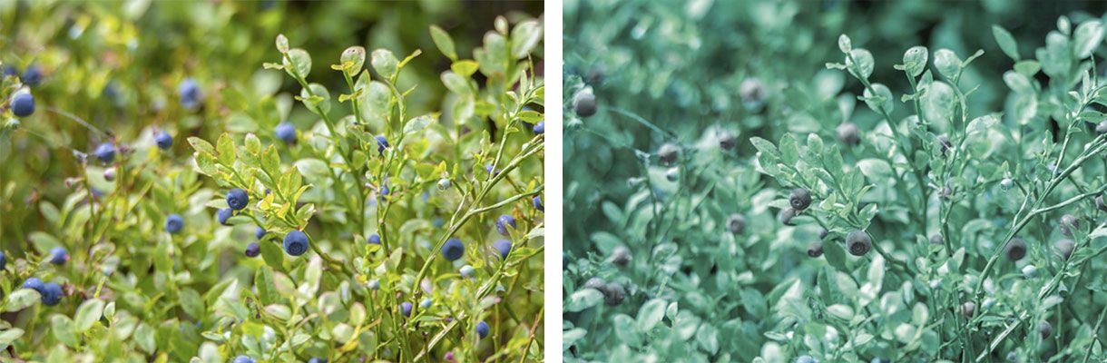
A friend of mine is colorblind. Walking in a Norwegian forest on a late summer day you can’t miss the carpet of delicious blueberries covering huge areas, but if there is no substantial difference between the berries and the rest of the plant you’re on a tough journey. You will have to recognize the berries by their shape only which is considerably more difficult.
Relying on colors only can be dangerous. Most of the time we can tell if a fruit or a vegetable is ripe and good just by looking at the colors; We automatically throw away an apple that has turned brown – decay has begun and we flee.
Walking the woods we talked about web stuff and came over Google search results which change from time to time. I mentioned that visited links in the search results list had changed – that it might be something with the purple color.
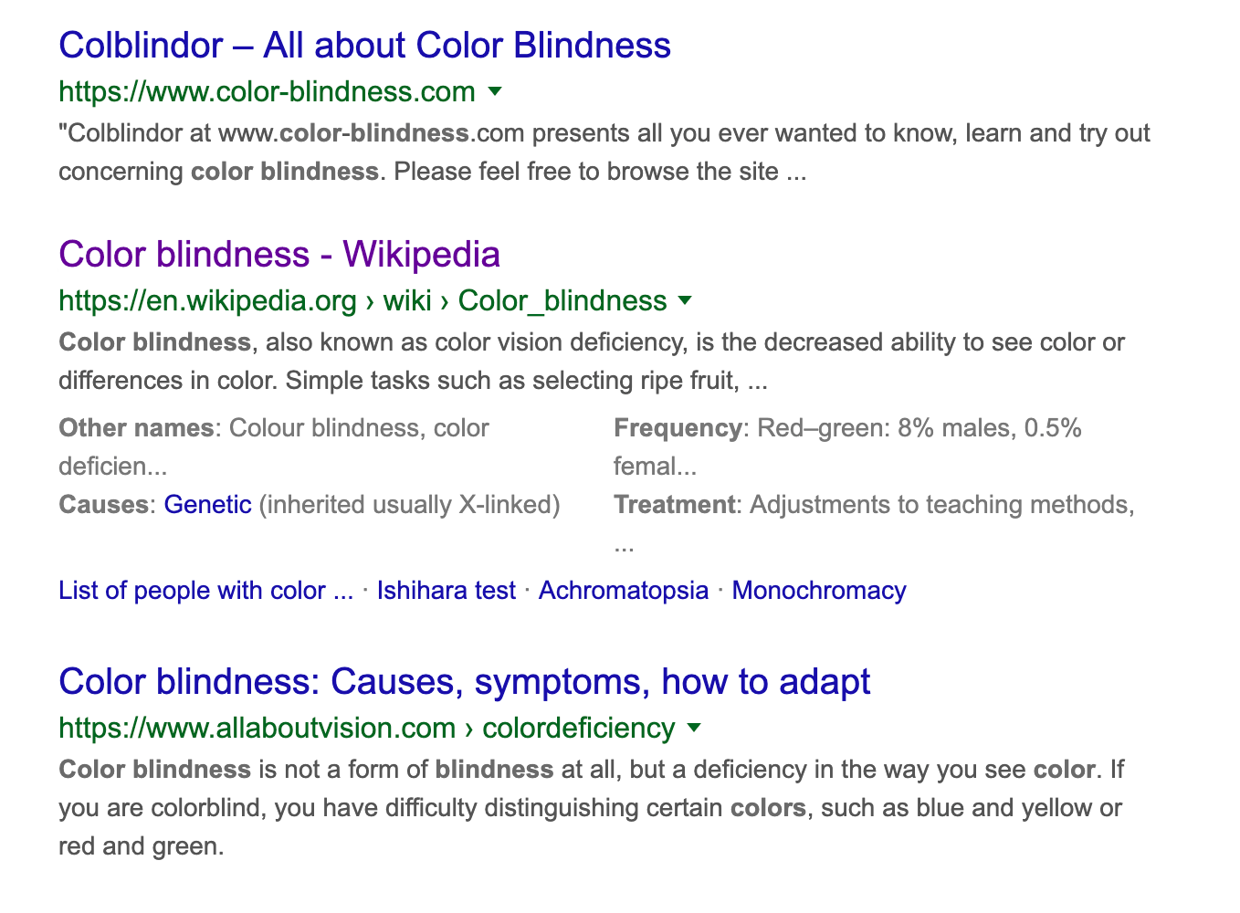
My friend looked surprised. He never realized that you can tell if a link in Google's results list was previously visited simply because he could not see any difference in the colors – blue and purple looks all the same to him. This is the default behavior in most browsers so Google is not especially to blame.
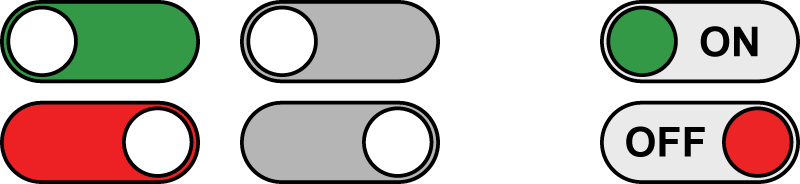
Similarly, some users will struggle to understand a simple green sign indicating that a thing is ON, or red when it's OFF if color is the only indicator.
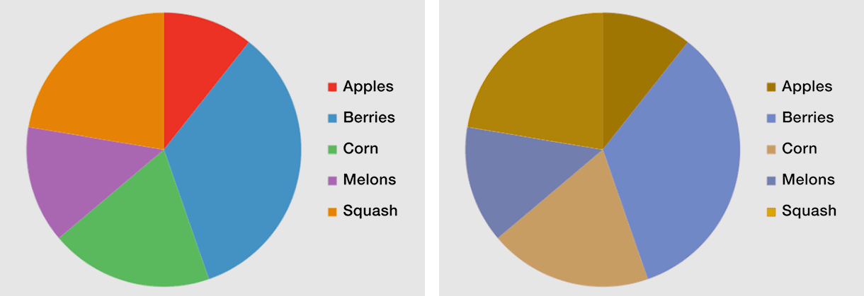
Relying on one perception channel only you will lose some users. Using more perception channels is safe.
Several ways of testing
If you're a designer, developer or site owner, you can always benefit from testing with a tool simulating color blindness. For this purpose, there is a great Chrome add-on called "Let's get color blind". Try it – I guarantee you WILL be surprised!
Another add-on "I want to see like the colour blind" does the same thing but with fewer options to tune for various types and strengths of color blindness.
An alternative to installing the Chrome add-on is this "Colorblind Web Page Filter".
If you're a web designer colorsafe.co is an excellent tool for finding matching color contrasts for typography.